Assessing the U.S. Climate
The graphic is for August 2022. To see a full re[port for a different month, change the date at the end of the link - after it loads--https://www.ncei.noaa.gov/news/national-climate-202105
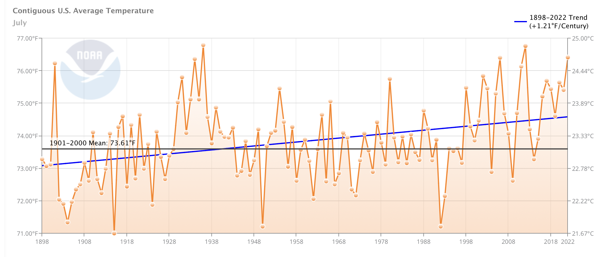
Status and Trends of United States (US) Temperatures Since
1898 (July-through 2022)
This is for July, compared to the
same perods in each year. It is not year-to-date compared to other whole years,
but rather for July compared to prior Julys since records
began. July is shown because it is the month followig June, which has the most intense sunshine and the longest day.
The temperature trend for the period of record (1898 to present) is 1.21 degrees Fahrenheit per century.
(Source: NOAA's
National Climate Data Center)
Some highlights from NOAA.
The average temperature of the contiguous U.S. in July was 76.4°F, which is 2.8°F above average, ranking third warmest in the 128-year record. Generally, temperatures were above average and/or record-warm across nearly all of the Lower 48, with Texas having its warmest July, May-July and April-July on record.
July precipitation for the contiguous U.S. was 2.74 inches, 0.04 inch below average, ranking in the middle third of the historical record. Precipitation was above average in pockets across the West Coast, Southwest, Northern Rockies and Plains, Great Lakes and from parts of the Midwest to southern Appalachians. Precipitation was below average across portions of the Northwest, southern Plains, Upper Midwest and Northeast.
A stalled frontal system, combined with rich Gulf moisture, resulted in historic flash-flooding events across portions of Missouri and Kentucky on July 26 and 28, respectively.
Several heat waves, with daytime temperatures over 100°F, occurred across much of the U.S. during July, contributing to record energy demand and heat-related illnesses.
The wildfire season appears to be waning across Alaska, but is still going strong across the West and southern Plains. Across all 50 states, more than 5.7 million acres burned from January 1 through July 31 nearly 1.5 times the average for this time of year.
According to the August 2 U.S. Drought Monitor report, 51.4 percent of the contiguous U.S. was in drought. Severe to exceptional drought was widespread from the Great Basin to the Pacific Coast and across portions of the central and southern Plains.
Recent Years: (Per NOAA) Annual Temperatures 2020 "Based on preliminary analysis, the average annual temperature for the contiguous U.S. was 54.4°F, 2.4°F above the 20th century average. This ranked as the fifth-warmest year in the 126-year record. The five warmest years on record have all occurred since 2012. ......
Based on NOAA's Residential Energy Demand Temperature Index (REDTI), the contiguous U.S. temperature-related energy demand for 2020 was 31 percent of average and the 7th lowest value in the 126-year period of record.
For the year, warm daily records outpaced cold records by a margin of approximately two to one. There were over 106,000 daily temperature records tied or broken during 2020."
Analysis: The US temperature has risen above the 20th century average, where it stood in 2017. Recent temperatures are not very different from the 1930s (time of the US western "dust bowl" years). If the advent of wide spread use of thermometers in the 1800s had not coincided with the end of the last Little Ice, would this rise be held in a different context?
The projected temperature rise by IPCC is unrealistic, given that the USA and global temperatures have risen by only 1.2 deg F (0.8 C) in 100 years or 150 years using the full instrumented data set during the height of industrial expansion. Even if all this rise is correct, and is attributable to human causes, it is a small amount in the natural variation of the Earth, and to suggest the rise would accelerate 5 fold (IPCC best estimate) in this century based on a gas that is 0.0004 of the atmosphere is hard to accept. Even after the release of the new data set and procedures by NOAA, which addressed some of the urban heat island issues and dropped the warming 44% (below IPCC 2007), significant other urban heat island issues still remain. There are also issues of calibration as measurement protocols have changed, issues about the design and placement of the temperature stations, and even the strongly held view by many skeptics that this is a natural rise as the Earth recovers from the Little Ice Age (circa 1500-1900) and even the last glaciation (9.7K years ago.)
If the city where you live has a higher temperature than its suburbs, you can imagine the impact of growth around the world on land-based temperatures. The USA has fixed many of these data problems. This is likely why the global temperatures rise while those of the USA are somewhat more "normal", but the USA has also adjusted its data sets in ways that raise many questions and suspicions among scientists that are not part of the "consensus" group. Adjustment of at-sea and on-land and atmospheric data is legitimate and necessary as technologies evolve (e.g., a bucket of water on a sailing ship in the 1800s is warmer on a hot day than the water intake on a modern ship which is sampling cooler water 5-15 meters below the surface. The adjustment is difficult and original, unadjusted data must be preserved and kept available for possible future use. When results change, as when a series of warm or cold years disappear in the adjusted data, careful explanation and further review is necessary.
The table below summarises some of the differences in various weather elements in urban areas compared with rural locations (Source: British Met Office).
| Sunshine duration | 5 to 15% less |
| Annual mean temperature | 0.5-1.0 °C higher |
Winter maximum temperatures |
1 to 2 °C higher |
| Occurrence of frosts | 2 to 3 weeks fewer |
| Relative humidity in winter | 2% lower |
Relative humidity in summer |
8 to 10% lower |
Total precipitation |
5 to 10% more |
| Number of rain days | 10% more |
| Number of days with snow | 14% fewer |
| Cloud cover | 5 to 10% more |
| Occurrence of fog in winter | 100% more |
Amount of condensation nuclei |
10 times more |
The formation of a heat island is the result of the interaction of the following factors:
-
the release (and reflection) of heat from industrial and domestic buildings;
-
the absorption by concrete, brick and tarmac of heat during the day, and its release into the lower atmosphere at night;
-
the reflection of solar radiation by glass buildings and windows. The central business districts of some urban areas can therefore have quite high albedo rates (proportion of light reflected);
-
the emission of hygroscopic pollutants from cars and heavy industry act as condensation nuclei, leading to the formation of cloud and smog, which can trap radiation. In some cases, a pollution dome can also build up;
-
recent research on London's heat island has shown that the pollution domes can also filter incoming solar radiation, thereby reducing the build up of heat during the day. At night, the dome may trap some of the heat from the day, so these domes might be reducing the sharp differences between urban and rural areas;
-
the relative absence of water in urban areas means that less energy is used for evapotranspiration and more is available to heat the lower atmosphere;
-
the absence of strong winds to both disperse the heat and bring in cooler air from rural and suburban areas. Indeed, urban heat islands are often most clearly defined on calm summer evenings, often under blocking anticyclones.
The precise nature of the heat island varies from urban area to urban area, and it depends on the presence of large areas of open space, rivers, the distribution of industries and the density and height of buildings. In general, the temperatures are highest in the central areas and gradually decline towards the suburbs. In some cities, a temperature cliff occurs on the edge of town. This can be clearly seen on the heat profile below for Chester.
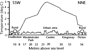
Urban heat island in Chester
The Urban Heat Island (UHI) describes the increased temperature of urban air compared to the rural surroundings. The term ‘heat island’ is used because warmer city air lies in a ‘sea’ of cooler rural air.
The figure below shows a stylised heat island profile for a city, showing temperatures rising from the rural fringe and peaking in the city centre. The profile also demonstrates how temperatures can vary across a city depending on the nature of the land cover, such that urban parks and lakes are cooler than adjacent areas covered by buildings.
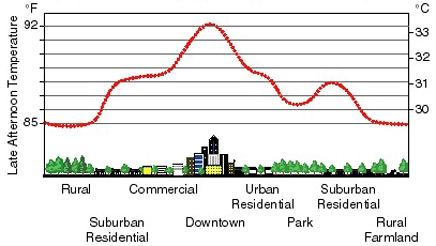
Sketch of an urban heat island
Source of chart and text: The Met Office
The higher urban temperatures are caused by the increased capacity of the urban land surface (eg. roads, buildings, pavements) to absorb and trap heat.
This results in towns and cities remaining noticeably hotter than the surrounding countryside, particularly at night on calm, clear summer nights. The UHI can add 5-6°C to the nighttime temperatures experienced. During the summer heatwave of 2003, differences of up to 9°C between city and rural temperatures were measured in London.